7.1. Matlab plotApp for In-Depth Analysis
Plotting data using the plotApp function
plotApp is a Matlab graphical user interface (GUI) made to facilitate visualization of database traces as:
(i) Basic time series;
(ii) Statistical summary;
(iii) Comparison amongst traces; and
(iv) Comparisons amongst stages.
We recommend using this plotApp during database creation and data cleaning.
Quick Start plotApp Instructions:
In Matlab, run
plotAppon the command line (figure 7.1).
Figure 7.1. How to launch the plotApp GUI in Matlab.
The GUI in figure 7.2 will launch; specify the folder containing the database you would like to plot by typing the folder path or by clicking the folder button and navigating to the desired folder.
- You need to specify the
\Database\folder (immediately beneath your project folder) rather than the individual year or site folder. - The Year and Site will be chosen from the drop-down menus which are automatically populated based on what is available in the folder.
- If you type in the folder path manually or paste it into the Folder field, press ‘Enter’ when complete.
- On subsequent uses of plotApp, it will remember the last Folder that was entered.
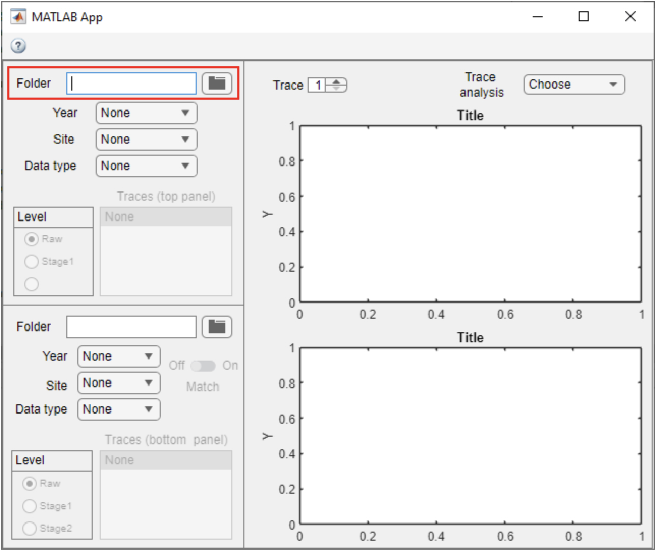
Figure 7.2. plotApp GUI showing where to enter the Database folder to view and analyze data.
- You need to specify the
Next, select the Year, Site, and Data type (Flux, Met, Clean, etc.) that you want to plot.
Flux and Met data type are associated with Raw and Stage1 traces. Clean data type is associated with Stage2 and higher.
Once these selections are made, the ‘Traces’ list will populate; then click on a trace to select it and plot the time series (figure 7.3).
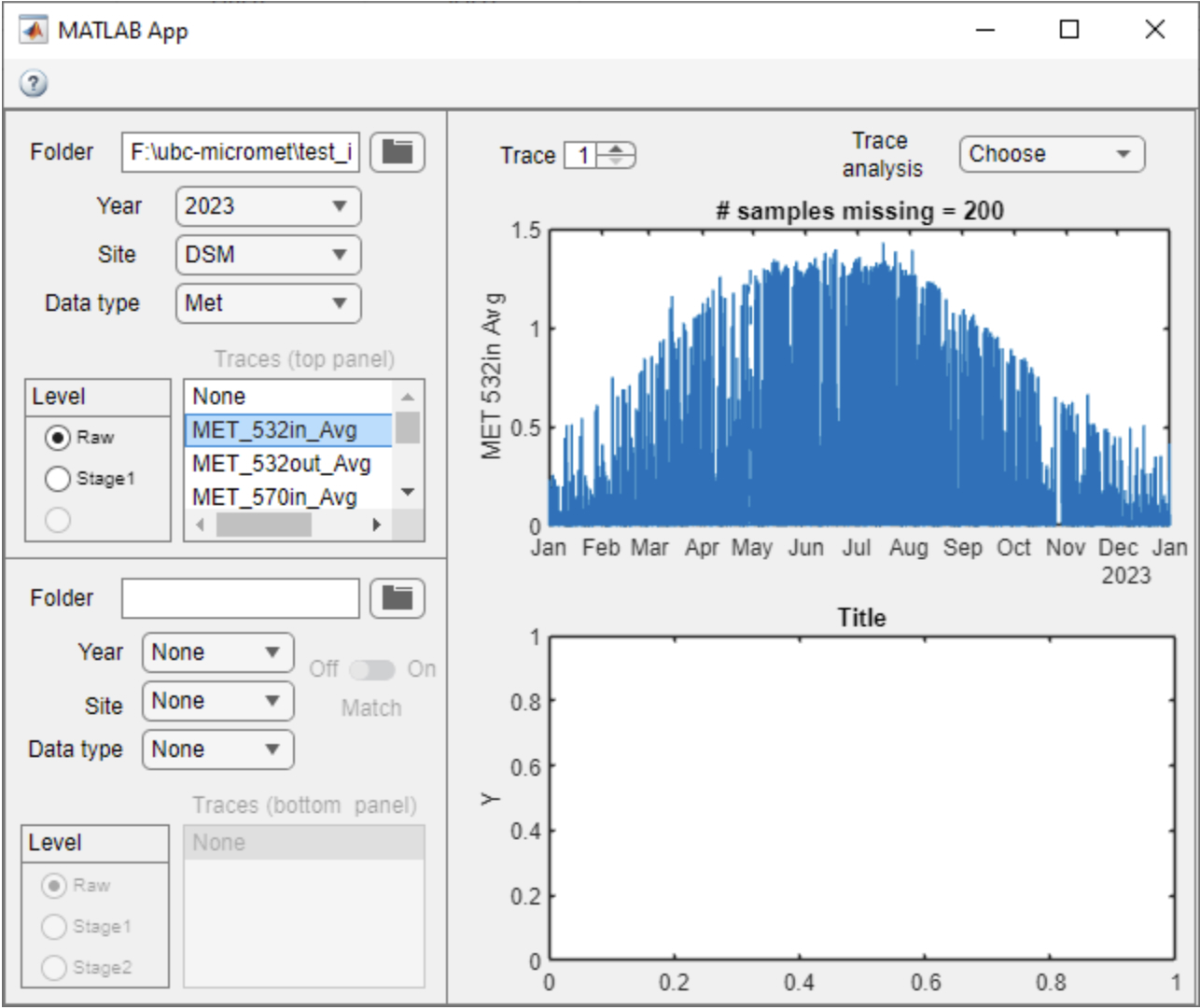
Figure 7.3. Example of plotApp GUI showing time series plotted after selecting data.
You can use the Matlab window navigation tools (i.e., zoom, pan, data tips) to explore the traces.
Two traces can be plotted at once for quick and easy reference, or for qualitative visual comparisons.
Trace Analysis
The Trace analysis drop-down menu has four options:
(i) Single trace;
(ii) Plot parents;
(iii) Compare traces; and
(iv) Compare Stages (coming soon…).
- Options (i), (ii), and (iv) operate on a single trace, which is defined by the ‘Trace’ selector
 (i.e., 1 or 2, upper or lower panel, respectively).
 - Option (iv) compares the selected trace with its previous stage.
- Options (iii) operates on both Trace 1 and 2.
Single Trace
A basic summary of a single trace can be plotted using the Trace analysis drop-down menu.
For the single trace summary, first select Trace ‘1’ (upper panel) or ‘2’ (lower panel) using the up/down buttons.
From the Trace analysis drop-down menu, select ‘Single trace’.
A new window will open with the trace summary (figure 7.4).
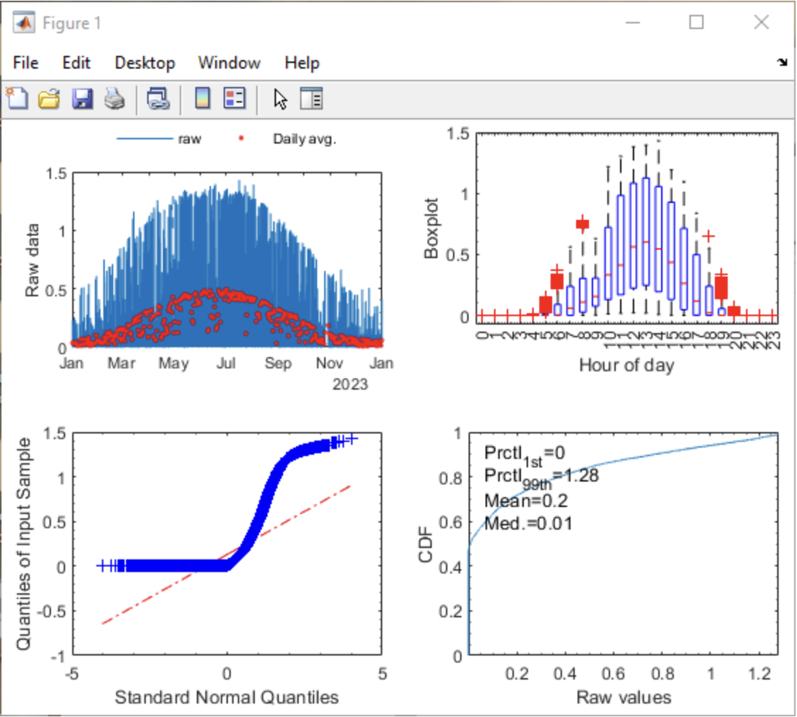
Figure 7.4. Example of single-trace summary in plotApp GUI.
The four panel ’Single trace’ summary includes (i) upper left – raw half-hourly data and daily average; (ii) upper right – diurnal trend using boxplots on an hourly basis; (iii) lower left – Q-Q plot; and (iv) lower right – cumulative distribution with 1st and 99th percentile, mean, and median printed.
- Panels (ii)–(iv) are a summary of the raw data in panel (i).
- Users can interact with panel (i) using the Matlab navigation tools (zoom and pan only) to analyze a subset of the data.
- After zooming/panning, panels (ii)–(iv) will automatically update.
- To restore the view to the whole data set, with zoom out selected, double-click panel (i). Alternately, right click on panel (i) and select ‘Restore view’ from the drop-down.
Compare traces
A basic comparison of Trace ‘1’ and ‘2’ can be plotted using the Trace analysis drop-down menu and selecting ‘Compare traces’.
A new window will open with the trace comparison (figure 7.5).
Any two traces can be compared. There are no restrictions on Site, Data type or Level, but currently the Year must be the same for each trace.
An error message will appear if only one trace is plotted or if Year doesn’t match.
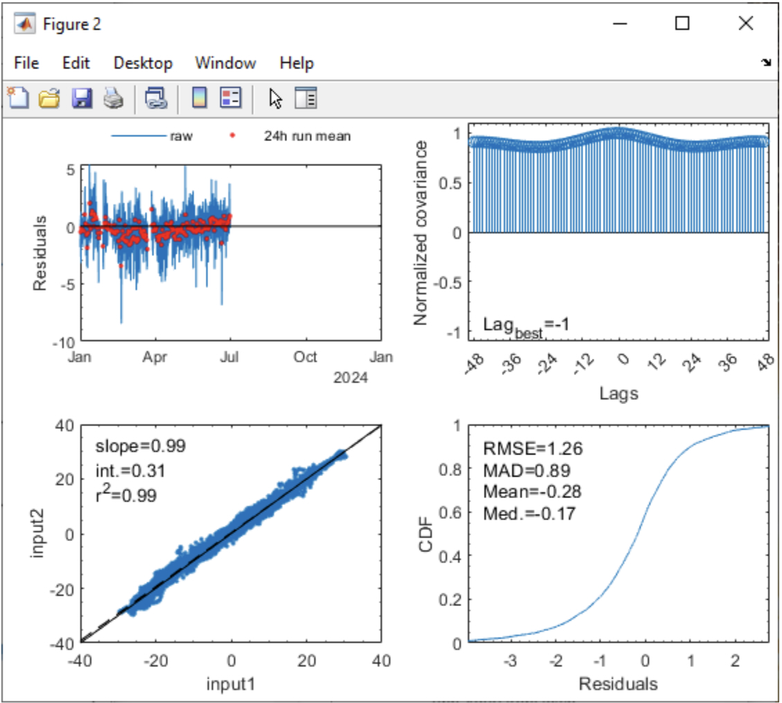
Figure 7.5. Example of ‘Compare trace’ summary in plotApp GUI.
The four panel ‘Plot comparison’ summary includes (i) upper left – raw half-hourly residuals and their daily average; (ii) upper right – normalized cross-covariance for +/- 48 measurement intervals; (iii) scatter plot comparing the two traces; and (iv) lower right – cumulative distribution of the residuals.
- As for the single-trace analysis, users can interact with panel (i) using the Matlab navigation tools (zoom and pan only) to analyze a subset of the data.
- After zooming/panning, panels (ii)–(iv) will automatically update.
- To restore the view to the whole data set, with zoom out selected, double-click panel (i). Alternately, right click on panel (i) and select ‘Restore view’ from the drop-down.
- Panel (ii) displays the lag with the highest cross-covariance between the two traces for data visible in panel (i).
- Panel (iii) displays the slope and intercept of the linear regression between the two traces, along with the r2 value for data visible in panel (i).
- Panel (iv) displays the root mean squared error (RMSE), mean absolute deviation (MAD), mean, and median of the residuals in panel (i).
Plot parents
The Trace analysis option is meant to aid the assessment of data cleaning amongst stages. For example, if more data is removed due to data cleaning than expected, Plot parents can be used to help identify which parent trace resulted in data removal.
The ‘Trace’ selector (i.e., 1 or 2) defines which trace will be analyzed and displays the analysis in a new window (figure 7.6).
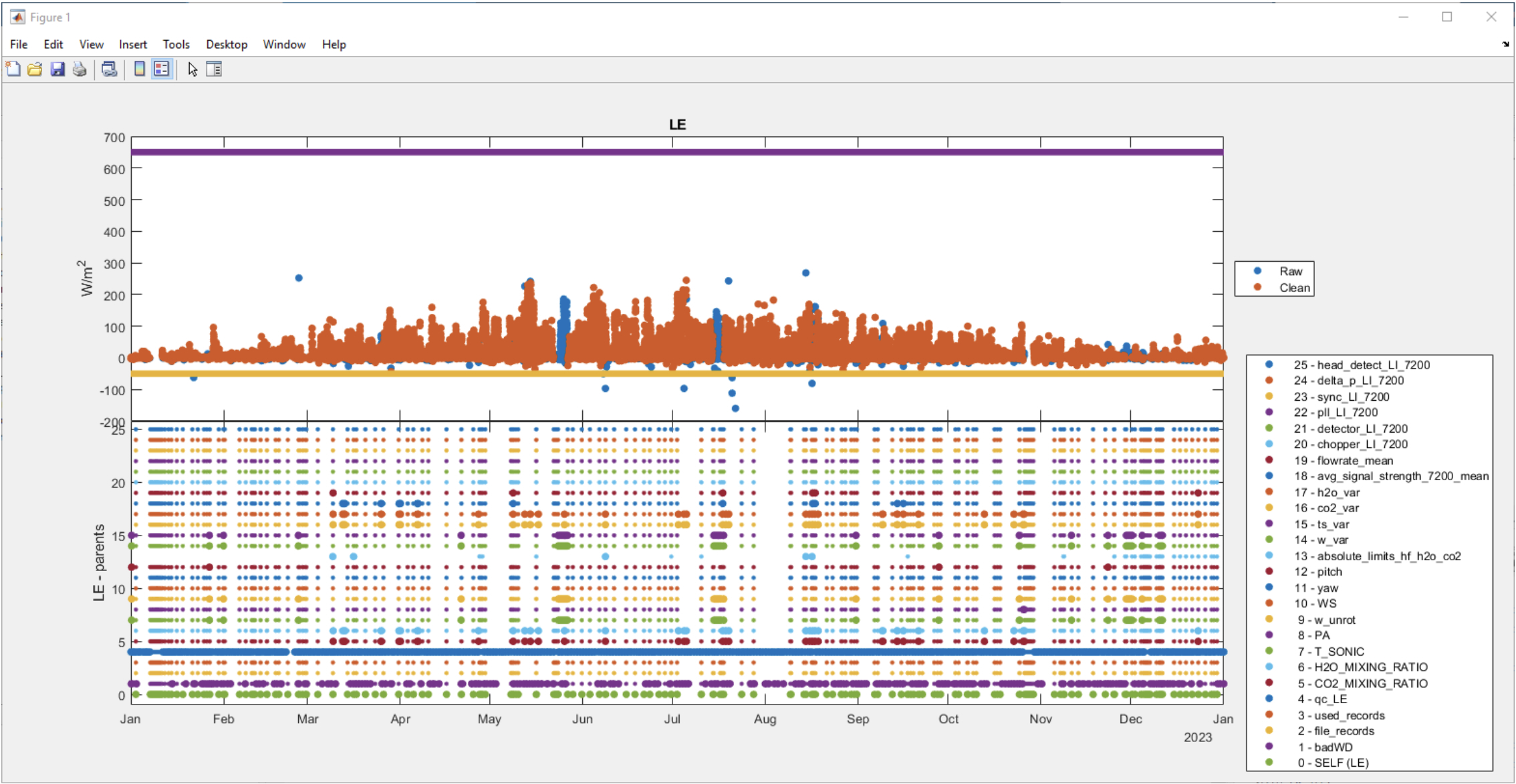
Figure 7.6. Example of ‘plot parents’ display in plotApp GUI.
For a particular stage, ‘Plot parents’ shows the data from the current stage (orange circles, upper panel) and contrasts with the previous stage (i.e. blue circles, upper panel).
The minMax=[] bounds for the trace defined in the .ini file for the particular site are shown in the upper panel in yellow and purple.
The lower panel shows all the parents of a particular trace (i.e., those traces which include that trace as a dependent=’’ in the INI file). Note, dependents are often called using ‘tags’.
In the lower panel, 0 - SELF refers to data which are missing before cleaning based on dependents.
For all other parents, a large dot indicates a point which was removed from the selected trace which was not missing in the previous stage. A small dot indicates the data from the selected trace would be removed based on the parent, but was already missing from the previous stage.
Users can interact with the figure using the Matlab navigation tools (e.g., zoom and pan) to view a subset of the data.
- It is recommended that you only zoom/pan the top panel.
- The x-axis of the top and bottom panels are linked, so navigating in one panel will automatically update the x-axis on the corresponding panel.
Compare traces
This option in Trace analysis is intended to quickly assess what changes occurred between stages for a particular trace.